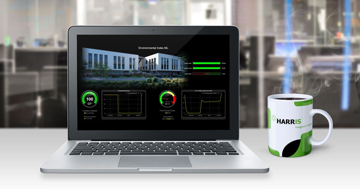
My dream car is a ’69 Z/28 Camaro. The dashboard was a big reason. It had a big MPH dial on the left, a big RPM dial on the right and a clock stuck in the middle. Mounted below were alarm lights to show if something malfunctioned. Then there were 4 more gauges on the console near the shifter – fuel, oil pressure, battery voltage and temperature. It was one of the coolest dashboards. After all, it is a high-performance vehicle. All that information just by looking around without taking your hands off the wheel or foot off the pedal.
Using this analogy, if a 50-ton chiller starts to go “glitchy”, the last thing a technician needs to do is pour over columns of numbers or coded data trying to decipher what is happening. They do not need to search for the problem buried under piles of programming language. They need graphic information that is visible. They need to look at dials, alarm lights, and gauges all in one image. By the time the issue is found hidden under all that data, it may be too late.
Building Automation System (BAS) dashboards are a powerful way to present data-based intelligence by using visualization. Dashboards exist to show a comprehensive overview of important data to keep the equipment in top notch condition. That is why dashboards are so vital. They give a graphic snapshot of what is going on with the equipment.
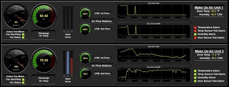
Not all dashboards are the same. They vary from automation vendor to automation vendor. Without the proper design, a dashboard is totally worthless no matter how colorful or shiny it is. Even though they may be different in color or shape, they must show the best information possible.
If you are a vendor designing a dashboard, you must design with the customer in mind. “Who will be using it the most?” or “What do they need to see?” are the questions that need to be answered. A facilities director wants to see something different than an HVAC technician. Contact the customer and build it for their use. The dashboard needs to be created for their needs.
If you are a customer, let the vendor know what you want to see most. What information do you need that will flow with your objectives and goals. You are paying for it and it should be designed for you since your organization will be using it most.
So, here are a few tips at what to look for in a good functional dashboard:
TIP 1: Most Used Info Should be Big – Least Used Info Small
All information is important but some info is not used as much as other. The most used information on an automobile dashboard is the speedometer. That is why it has the premier place and large size. Dashboards need to reflect that design. The most important thing on an HVAC dashboard is temperature. Room, supply air or water temp from the unit are the most important. Like the speedometer, they show whether the unit is “going” or not. The smallest item should be something like dirty filter or energy efficiency. They are important but not used as much as temperature or humidity readings. Diesel generators need to show wattage output largest and oil pressure smallest. Oil pressure is very important but not used as much as wattage output.
TIP 2: Choose Featured Data Wisely
A busy dashboard can distract instead of help. A bare dashboard can be useless and miss key information. Middle ground has to be determined. Remember the average attention span is 8.25 seconds and getting shorter by the decade. In choosing the right amount of data to display, there are some things to consider:
- Exact representation of equipment
- Target audience
- What data/information needs to be relayed
- Choose relevant key performance indicators (KPI’s)
- Left to right – like reading a book
- Rounded numbers
- Define data in detail
- Use animation and interactive elements as much as possible
TIP 3: Consistency is Key
I have heard the phrase “All we need is another software to learn” many times in teaching a class to end users. We all fear something new we do not understand. Consistency on all dashboards will help resolve issues of having to relearn phrasing, new jargon, and location of key information. Using the same wording, dials, alarm indicators, graphics, etc., reduces the need to learn something new. Besides, consistency looks good. Once one dashboard is understood and looks good, the other dashboards will fall into place. The sun will shine. Birds will sing. Life will be good.
TIP 4: Change is Inevitable
The only constant thing in life is change. Make sure the dashboard is editable. People change. Objectives change. Equipment changes. There will be times revisions have to be made. They will need to evolve from time to time so make room for growth.
Remember, with all the “virtuality” and cybernetic technology, dashboards are crucial in today’s building systems and their design needs to reflect their importance almost as much as the equipment itself. Let us know if we can help. Schedule a demo today.

Tony Holcomb | Energy Consultant
Tony Holcomb is an Energy Consultant with Harris Integrated Solutions. He is retired Director of Maintenance and Operation for Georgetown County Schools in South Carolina. He served three years as Vice-Chairman for the Association of South Carolina Energy Managers, won South Carolina Energy Manager of the Year in 2016, and won South Carolina Energy Project of the Year in 2013.
To Holcomb, his biggest career accomplishment was not having to increase Georgetown County School District’s energy budget over 14 years, helping keep teachers employed and students learning.

